by Nick
Posted on 17 September, 2018
Last week, I attended a Pandemic Influenza Exercise at the US CDC. To be clear, there is NOT a pandemic occuring right now, but the CDC ran this exercise where hundreds of staff members and outside observers and participants came together to practice going through the motions of a public health response to a major pandemic. As someone who is usually sheltered from this everyday aspect of public health decision-making, this was a fascinating window into understanding the careful, if time-pressured, scientific deliberation that underlies the response to public health emergencies.

I was sitting with a team called Risk Assessment and Forecasting, and was one of three academic forecasters in this group. (The others were Jeff Shaman and Roni Rosenfeld.) When I was invited, I wasn’t sure whether I was going to spend these three days scrambling on my computer to actually run data analyses or not. As it turned out, our job was more to listen, watch, and occasionally give some input about what kind of data would be helpful if we were needing to produce real-time pandemic forecasts. Jeff was the only one of us who had actively worked in producing real-time pandemic forecasts before (e.g., for the Ebola outbreak).
There are lots of open questions about what kinds of models would be useful and how you might go about setting up forecasting models (especially more statistical models) in a real pandemic. Fortunately for public health (although unfortuantely for the science of forecasting), we don’t get many opportunities to practice. There were a handful of good forecasting studies during Ebola, and these provide some of our best data on the models and experience of creating forecasts in real-time during large global outbreaks. Never before had a global pandemic occurred at a time when a number of different research groups had the capacity and technical knowledge to implement reasonable attempts at forecasting the trajectory of a pandemic.
Over the course of the past week, our team at the CDC exercise talked a bit about data that would be useful in real-time for pandemic forecasting. One thread of this conversation focused on real-time epidemiological data that would be collected during the outbreak. For example, consistently sampled surveillance data, especially laboratory-confirmed case counts and strain-specific positivity rates, would provide valuable measures of infection rates in a population at a given time that could be used in models.
However, a second thread focused on data that exist right now in various forms that may also be useful in pandemic settings, especially if they were made more readily and easily available. I am a forecaster and statistician whose team builds mostly “statistical” models, that is, models that rely strongly on previously observed empirical data and patterns in similar prior situations. This is an uncomfortable position to be in when forecasting new emerging pandemics, as there are so few “comparable” events on record. This approach constrasts with more “mechanistic” model-building approaches that rely heavily on a structured set of assumptions about susceptibility in the underlying population, and how transmissible the population is, etc…
So the statistician/data-scientist in me argues that there would be not insignificant value in having some curated datasets on pandemics. Certainly things have changed dramatically since 1918, 1957, 1968, and even 2009, so what we can learn from those settings in a new influenza pandemic would be limited. But having both a historical understanding of pandemics as well as some data from those outbreaks can provide useful insights into potential future dynamics of pandemics.
Some circulating questions during the recent CDC exercise revolved around whether there would be a hypothetical second wave and if so, what it would look like. Mechanistic models could start to answer that question quantitatively early on in an outbreak, but I’d argue that for a while they’d be so uncertain as to be almost useless in a hypothetical pandemic response. To start to answer the question about a second wave, I wanted to look at past data. It is not obvious what the best source of data like this is, and there does not appear to be a single authoritative repository or archive of data on pandemic flu. That’s what set me off on a hunt to make some plots of influenza pandemic dynamics over the past century.
After a brief and unsuccessful round of Googling for public datasets on pandemic flu, I turned to Project Tycho, a carefully curated public repository of infectious disease data. As it turns out (as you will see below), the data they have on influenza (and pneumonia) is not particularly helpful or exhaustive, but it was at least a place to start. So I’ll walk through an edited and simplified version of some of the back-of-the-envelope descriptive analyses I ran for myself this week. In particular, I’m going to walk through the creation of two different plots of public pandemic data from two different Project Tycho data sources that I tried to use to help me think about the potential of a second wave.
I’m going to walk through this analysis in R, so first let’s get some preliminaries out of the way to get my R session set up…
library(data.table)
library(dplyr)
library(ggplot2)
library(MMWRweek)

theme_set(theme_bw())  ## because I don't like the ggplot default theme :-)
Let’s start by using the Project Tycho API to access data through R. To replicate this analysis, you will need to create an account (if you don’t have one already), find your API key on your profile page, and insert it in the code below.
APIKEY <- "put-your-key-here"
I toggled back and forth for a while from my code and the Project Tycho API site to build some code to construct an API query. It took some time to figure out exactly which “Condition Name” I should use, but after some hunting and pecking it turned out the best data for either pneumonia or influenza during the 1918 pandemic is case and death data for pneumonia. The following code sets up the query:
baseAPIlink <- "https://www.tycho.pitt.edu/api/query?"
ConditionName <- "Pneumonia"
CountryISO <- "US"
PeriodStartDate <- "1918-01-01"
PeriodEndDate <- "1921-12-31"

API_link <- paste0(
    baseAPIlink,
    "apikey=", APIKEY,
    "&ConditionName=", ConditionName,
    "&CountryISO=", CountryISO,
    "&Fatalities=0&PartOfCumulativeCountSeries=0",
    "&PeriodStartDate>=", PeriodStartDate,
    "&PeriodEndDate<=", PeriodEndDate
)
Then, I downloaded the data and made a few small data transformations
for easier management later, like making date fields dates and expanding
the dataframe to have NA for missing values instead of just having
entirely missing rows.
pneumo_dat <- read.csv(API_link, header=TRUE) %>%
    mutate(
        PeriodStartDate = as.Date(PeriodStartDate),
        PeriodEndDate = as.Date(PeriodEndDate)
        ) %>%
    tidyr::complete(CityName, PeriodStartDate)
Since not all cities have a lot of cases, I did some subsetting to identify just cities that had both a lot of cases and weeks where cases were reported.
cities_with_1918 <- pneumo_dat %>%
    filter(PeriodEndDate>as.Date("1919-12-31")) %>%
    group_by(CityName) %>%
    summarize(tot_records = sum(!is.na(CountValue))) %>%
    filter(tot_records>60) %>% .$CityName

big_cities <- pneumo_dat %>%
    group_by(CityName) %>%
    summarize(tot_count = sum(CountValue, na.rm=TRUE)) %>%
    filter(tot_count>1000) %>% .$CityName
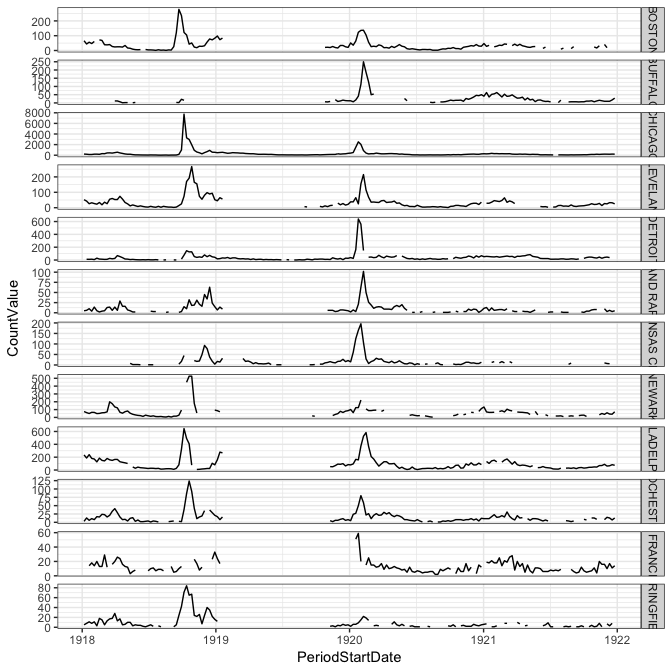
Once we have all that done, it’s not that difficult to use ggplot to
construct a plot of pneumonia deaths during and after the 1918 pandemic.
ggplot(filter(pneumo_dat, CityName %in% big_cities, CityName %in% cities_with_1918),
    aes(x=PeriodStartDate, y=CountValue)) +
    geom_line() + facet_grid(CityName~., scales="free_y")

The dataset I used above ends in the early 1950s, so it didn’t cover the other influenza pandemics of the second half of the 20th century. However, the “Level 2” data from Proejct Tycho (available, as best I could tell via a zip file download but not through the API) does have some different data that covers the 1968 pandemic. If you’re trying to run this code, you will need to download the Level2 data and insert below the path to your csv file.
fname <- "your-path-to-download/ProjectTycho_Level2_v1.1.0.csv"
I used data.table to read it in, since it’s a big ol’ file (~450MB).
DT <- fread(fname)
fludat <- DT %>%
    select(-url) %>%
    filter(disease %in% c("INFLUENZA", "PNEUMONIA", "PNEUMONIA AND INFLUENZA")) %>%
            mutate(
                from_date = as.Date(from_date),
                to_date = as.Date(to_date),
                year = as.numeric(substr(epi_week, 0, 4)),
                city_state = paste(loc, state)
            ) %>%
    tidyr::complete(city_state, epi_week)
As was necessary in the first example, this needed a bit of cleaning up to prepare for plotting.
aggpidat <- fludat %>%
    filter(epi_week>196700, epi_week<197100, event=="DEATHS", disease=="PNEUMONIA AND INFLUENZA") %>%
    mutate(date = MMWRweek2Date(as.numeric(substr(epi_week,0,4)), as.numeric(substr(epi_week,5,6))))
Again, I tried to focus on cities where there were higher counts and more weeks with observed data.
big_pi_cities <- aggpidat %>%
    group_by(city_state) %>%
    summarize(tot_count = sum(number)) %>%
    filter(tot_count>2000) %>% .$city_state

cities_with_1968 <- aggpidat %>%
    filter(epi_week>196800, epi_week<197000) %>%
    group_by(city_state) %>%
    summarize(tot_records = n()) %>%
    filter(tot_records>60) %>% .$city_state
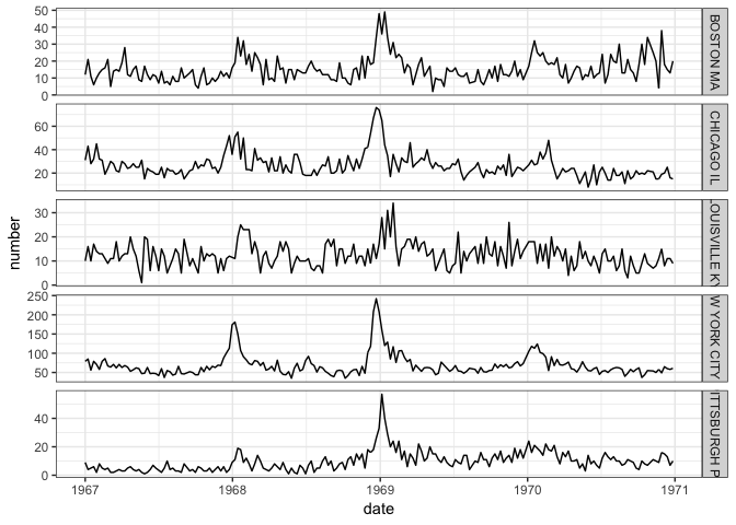
And, here’s the plot:
ggplot(filter(aggpidat, city_state %in% big_pi_cities, city_state %in% cities_with_1968), aes(x=date, y=number)) +
    geom_line() + facet_grid(city_state~., scales="free_y")

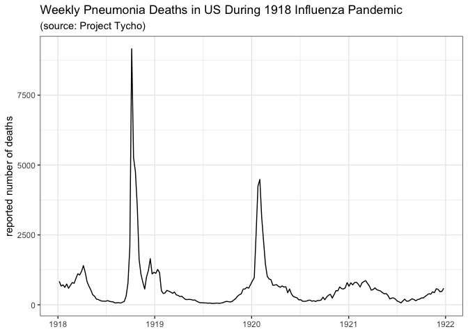
These few plots tell us just a little bit about these historical pandemics. In 1918, the best data from Tycho seemed to be about pneumonia, but even then, as is evident from the city-level data, there are lots of gaps in the observations. This is not as evident in the overall aggregate data shown in the first plot above the fold. In 1918, the data clearly show a first peak in late 1918 and then a second peak in early 1920, although most cities are missing data for almost all of 1919. In the 1968 pandemic, there seems to be a small first wave (or maybe just a larger seasonal wave) in the 1967/1968 season followed by a larger peak right around December 1968 and January 1969. But this analogy to the flu pandemic is dependent on the assumption that reported pneumonia deaths serve as a reasonable proxy for incident flu cases.
Certainly there must be more and better data out there on influenza
pandemics. For the 2009 N1H1 pandemic, we could retrieve data from 2009
from the CDC
FluView
application (which has a nice interface from R in the cdcfluview
package) But I’m sure there is
more data on these older pandemics as well out there. It might require
heading into the depths of library stacks, or poring through academic
papers, or finding other less well-established data repositories. But
having this data systematically organized in one place would be useful,
and not all that hard, at least to get it started.
Once again, this is just one very small piece of a huge puzzle of pandemic response. Clearly assembling some historical data isn’t going to prevent the next pandemic, nor will it directly inform countermeasures or interventions that are part of the response. Especially given how difficult it is to generalize from these once-in-a-generation type experiences, it is unclear how directly applicable these data are to a hypothetical emerging outbreak. That said, we have precious little real data about pandemics to go on. And there’s no reason to drive blind without having better and more accessible versions of what could be a valuable source of information about dynamics of pandemic second waves, spatial variation in outbreaks, and more.